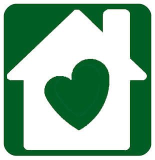
Apparently, the Peaceful Parenting blog has been trying to crowdsource a symbol that homebirth advocates and organizations could use as an identifier. It's a good idea, since causes need symbols just like nations need flags.
A good bar has been set, both in similar cause and public acceptance, by the "you're welcome to breastfeed here" signs that are now common.
Here is an explanation of how they are doing it:
"The finalists for the International Homebirth Symbol have been chosen by a panel of birth and babies professionals and mothers alike (see panel members here). They are presented here for your vote. Graphics are drafts and may be brushed up or altered slightly for finalization. Color/shade will also be voted on publicly once the symbol is selected. All are presented here in the same shade for voting purposes only. Artists will remain anonymous to the panel and public until voting is complete. The top symbols will go on to Round Three where they will be voted on by a panel of graphic design artists."I like that they are putting these forward as abstract symbols, without consideration for colour or perfection of execution.
In situations like these, I try to ask myself WWPAD? (What Would Paul Arthur Do?). The sadly-missed godfather of pictograms, signage and wayfinding could have really helped these folks. I briefly knew the man, who famously decided it was a good idea to use symbols instead of "men" and "women" at Expo 67 — something we cannot today imagine a world without. (He was my S-I-L Laura's stepfather.) But since he died when I was just starting to enter the fullness of my creative career, I never got to work with him professionally. Instead, I am inspired by skimming his books and reading others' memories, like this frank critique of proposed icons for the "World Wide Web."
I am no designer — and certainly no Paul. But I would like to bring this interesting exercise to the attention of my fellow professionals.
Here are the entries:
 |
| A: I get it, but it has an unfortunate resemblance to the internet shock meme goatse man. (If you don't know what that is, you're lucky. Here's the Wikipedia link. |
 |
| B: Sweet, but says "healthy pregnancy" more than "birth" to me. |
 |
| C: The addition of the partner is nice, but not inclusive. Single women and gay women also homebirth, an the supporter is not always a partner. |
 |
| D: Not bad. I like the "yoga" look and the simplicity. I only wish the house icon were simpler. |
 |
| E: Too abstract for me. Pretty sure this would fail comprehension tests. |
 |
| F: A literal attempt to say "home birth". Kind of confusing. I also associate realistic foetus silhouettes with anti-abortion causes. |
 |
| G: A nice thought, but overly simplistic. The heart as mother and child has been done before, and does not necessarily communicate "birth". |
 |
| H: As with others, this shows motherhood but could be post-partum at home. |
 |
| I: Getting closer, but the shapes might not be 100% clear. |
 |
| J: The "woman birthing" icon is clearer, but looks a little nuclear. The lines in the house are superfluous. |
 |
| L: Overly abstract, like G, but with more of a "birthing" feel. |
 |
| M: An attempt to make pictograms out of "H" and "B". Besides being really abstract, it is language exclusive, and not international. |
 |
| N: Like the breastfeeding symbol, but with umbilical cord and house added. Might lead to confusion with the BF symbol, and cord might be too subtle to communicate the moment of birth. |
 |
| O: This says "loving nuclear family" to me, not birth. Also has the same heteronormative issue as C. |
 |
| P: A "primitive" (petroglyph-inspired) symbol that says "motherhood" more than anything. No implication of "birth" and "home". |
But that's the whole problem here. Functional design, such as this, should never be croudsourced or contested. It should be developed by specialized professionals, and tested extensively in controlled market research, to make sure it is understood.
The opinions I gave above are just first reactions — the kind of advice I would give to designers at an initial creative review, to help them refine their ideas and avoid wasting time on non-starters (like M).
Since Peaceful Parenting have already committed to this selection process, they can't stop now. But if they want to stand any chance of having the result widely adopted as a recognized symbol of homebirth, I hope they will turn the results over to professionals for final design, testing, and change if needed.
Trust me, it's the right thing to do. Because when symbolic logos fail, they fail hard.


This comment has been removed by the author.
ReplyDeleteI made a symbol, too. It is based on the breastfeeding Symbol. Check it out. Would love to get your feedback!
ReplyDeletehttps://www.facebook.com/photo.php?fbid=10151710249956252&set=a.388644341251.165328.95226231251&type=1&theater