Showing posts with label Retro. Show all posts

Tuesday, November 12, 2013

The problem of retro brand racism

Via CBC

When I was a kid, this kind of stereotyping on native people was simply part of the landscape. We had "Indian" costumes, wallets, fake tomahawks and plastic soldiers. And the brands around us reflected this casual racism.

But the potato chip packaging above is not from the 1970s. Krispy Kernels snack foods, of Quebec, decided to reintroduce their old packaging as a "vintage edition," according to the CBC.

Vintage bag, via Yum Yum

Interestingly, the old design was in use until 1990, when the Oka Crisis forced a more sensitive re-evaluation of Aboriginal issues in Canada.

While there is a certain value in recognizing how much things have changed in the past few decades, the ironic use of such a stereotype for marketing purposes seems at best misguided and at worst ignorantly racist.

It gets even worse: The company has an in-store contest that encourages people to take pictures of theor faces in a standee of a loinclothed "little Indian":


Both images via CJAD
Upon launch, ValĂ©rie Jalbert, CEO of Yum Yum Chips and Krispy Kernels, and Renee-Maude Jalbert, marketing director of Yum Yum Chips , happily posed with the campaign for La Presse.


Irkar Beljaars, a Montreal-based Mohawk journalist, told the CBC:

“It's just like ‘look at that, I'm pretending to be an Indian. You're just perpetuating racial stereotypes. You're just continuing to mock us by doing things like this.”

Interestingly, Krispy Kernels claims the packaging is a nod to the legendary founder of the potato chip (disputed), who was Native American:
It all began one August night when a customer, offended by the greasy taste of his french-fried potatoes, sent them back to the kitchen. Chef George Crum, who was of Native American descent (which inspired the Yum Yum logo), was equally offended by this return. Averse to criticism, Crum decided to seek revenge and furiously chopped up a new batch of potatoes. Slicing them as thin as paper, he threw them in a boiling hot oil-filled fryer and removed them once crisp and golden. He then seasoned them heavily and served his dish to the picky patron.
The company said the caricature on the package is a return to the company's roots, and is not meant to be mocking.

The campaign page has since been taken down.


Tuesday, August 20, 2013

Subaru ad serves up old-timey sexism

If they had web ads in the 1950s, I'll bet they'd look like this:


This ad, which compounds its failure by having a bad link, was spotted on Fark.com

There's also a banner:


I guess the archaic humour is supposed to be ironic. It might have worked for a beer brand, with the explanation "we're making fun of that sort of thing", but for a major automotive brand it's a lemon.


Monday, May 13, 2013

Fiat 500L: Big enough for a whipped cream party with three international beauty pageant contestants


I'm not sure if this is another spec ad or not. But one thing's for sure: It's not subtle.

The campaign, via Ads of The World, is by Leo Burnett, Spain.

Let's have a closer look at the guy with the whipped cream, shall we?

Yeah... no.

You've got to love the way his "cream" is spurting out all over the place.

The campaign has two more iterations. One is actually quite clever, if you're into '80s movies:


The other one takes a weird, retro-racist angle:


They're all, supposedly, about the Fiat 500L's bigger interior capacity. But the concept looks more like something that's been sitting around the creative department for a while, looking for an excuse to be executed.

Questionable subject matter aside, however, the illustration style is pretty neat.

Wednesday, January 30, 2013

Wheat Board ad uses ironic pin-up, takes a threshing


Using images from more sexist eras in modern ads can be tricky business. If people trust your motives, it can be sassy and ironic. But if your motives are questionable, it can just make you look out-of-touch.

I will guess that the ad above, created for the Canadian Wheat Board, was intended to be sassy and ironic. But it was not taken that way. According to Adfreak's David Kiefaber, "The ad has drawn criticism from the National Farmer's Union for using what critics say is an irrelevant and sexist image to hype the Wheat Board's services."

"What an image of a long-legged woman straddling a fence has to do with selling grain is beyond me," Joan Brady, NFU women’s president said in a news release. 
Brady said the CWB apparently doesn't realize that women are farmers and make decisions about who they want to do business with. 
"Whether in our own right or in partnership, we are deeply involved in all aspects of farming," she said.
I think the problem here is that the Wheat Board is in an industry that is perceived as conservative and old-school. So even if they approved the image as a way to seem more hip, because of the context they were taken at face value. You could advertise a bar or a rock concert with this. But perhaps it's too soon for a big agriculture to be postmodern.

The image is a 1969 Gil Elvgren pin-up titled "Hi-Ho, Silver". 


Wednesday, March 21, 2012

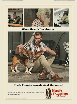
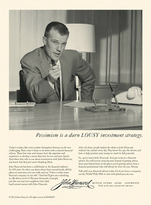
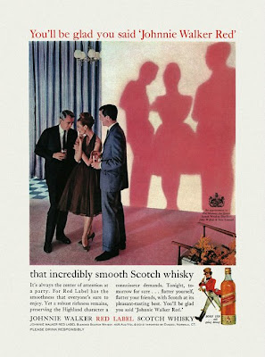
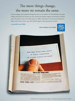
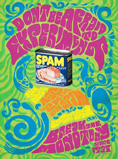
More faux-retro ads than you can shake a martini at


To celebrate the long-awaited return of Mad Men this Sunday, Newsweek yesterday launched a special issue with a retro design.

The best part, for many lucky modern admen and adwomen, was the invitation to submit special '60s-style ads for the occasion.

Some are better than others. All must have been so much fun to do.

Totally classic.

Great integration with current campaign.

Maybe a little too authentic.

I don't quite buy it. The models are all wrong.

Retro design done right.

Looks like 1990s faux vintage.

Cute.

The photo treatment could have been more authentic.

Dig the long copy.

Nicely done, with the Lyndon Johnson reference.

Too obvious for me.

Pretty authentic, but boring.

In the spirit, without being too silly.

Meh.

Captures our idea of the time.

A true classic.

The SPAM must have gone bad to make that happen.

Much better trippy design.

Cool.

Nice self-parody of their campaign.

What do you think?

All ad visuals via Fast To Create.

Friday, November 18, 2011

Tuesday, November 15, 2011

PETA brings you Bloody Mario


You've got to hand it to PETA. Their creativity is as boundless and their shamelessness.

This time, they're after Super Mario:

"When on a mission to rescue the princess, Mario has been known to use any means necessary to defeat his enemy—even wearing the skin of a raccoon dog to give him special powers.

Tanooki may be just a "suit" in Mario games, but in real life, tanuki are raccoon dogs who are skinned alive for their fur. By wearing Tanooki, Mario is sending the message that it's OK to wear fur. Play Super Tanooki Skin 2D and help Tanooki reclaim his fur!"

In this version of the game (complete with infuriating MIDI-type music), you are the skinned raccoon dog, chasing after a flying Mario, dripping blood from your flayed pelt he has wrapped himself in. Fun for the whole family!

Enjoy the game here.


Sunday, August 21, 2011

If sugar is fattening, how come so many kids are thin?

via
Facepalm, right? This kind of folksy anecdote is always dangerous, when used in place of science, but at least this was from a time when neighbourhoods were still built with sidewalks and and kids spent all day active outdoors.

Wednesday, June 22, 2011

More LEGO retro awesomeness

It turns out that the LEGO campaign I fell in love with last winter has an online video version:


I love the realistic silent home movie, the bad cuts, and the awkward posing. Why won't anyone let me do a campaign like this? *sigh*

Via Reddit