Showing posts with label 1960s. Show all posts

Sunday, December 23, 2012

The "good old days" when Santa sold smokes


The Guardian reported last October that a new edition of Clement C Moore's 1823 poem A Visit from St. Nicholas, which is widely attributed with popularizing the modern image of Santa Claus, has censored all references to the visitor's pipe:

"The stump of a pipe he held tight in his teeth, 
And the smoke, it encircled his head like a wreath"

Canadian publisher Pamela McColl released the bowdlerized poem through her own company, Grafton and Scratch.

Ms. McColl explains:
"I have edited out a few words and lines that reference Santa smoking and removed the cover illustration of his pipe. The omission of these few words do not change the material intent of the author nor do they infringe on the reader's understanding or enjoyment of this historically-rich story, but by removing these words we may save lives and avoid influencing new smokers," she says. "I think these edits outweigh other considerations. If this text is to survive another 200 years it needs to modernise and reflect today's realities. I want children to celebrate the spirit of giving and to reflect proudly on the holiday traditions that shape their childhood, and the best way to honour Santa and this story is to make him smoke-free."
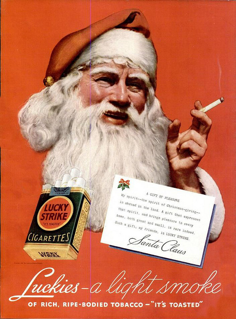
When my parents were kids, Santa didn't just smoke a pipe. Through the magic of big tobacco advertising, he also enjoyed promoting several brands of cigarettes:


Source

Source

Source
Source


I'd just like to add that I totally disagree with what Pamela McColl did to the old poem. 

I am also very much anti-smoking, but I am also anti-censorship. Old works are expressions of their time, and they provide an opportunity to talk with kids about why certain things were considered okay in the past, and why they are not now. In my opinion, this helps prepare kids for a world in which "normal" is a constantly moving target. By sheltering them, you only make them believe that the world was always as it is now. And how are they supposed to cope with change then?


You'll shoot your eye out, kid


Business Insider posted a collection of ads that paint a picture of American gun culture, past a present. What particularly struck me was this series of 1960s Christmas ads.


"You'll shoot your eye out, kid."

Friday, October 26, 2012

The Beatles' Apple is now Apple's Apple

Remember Apple? No, not that Apple. This one:
Via
When I was a kid, in the '70s and early '80s, finding an original Beatles album with the green apple label at a used record store was like finding gold. The iconic brand was founded by The Fab Four themselves as part of Apple Corps Ltd., and was intended not only to publish Beatles albums and singles, but also to sign unknown and deserving talent in music, fashion, even technology.

via

The original "Apple Store" in London, known as the Apple Boutique was a bust, losing so much money that The Beatles closed shop and gave away all the merchandise. The label did much better, signing notable performers such as Mary Hopkin, James Taylor, Badfinger, and Billy Preston (as well, obviously, as being home the most famous band in the world at the time).

Blank apple label signed by James Taylor.
Am I the only one who saw naughty things in it?

The original Apple brand was still going strong with Beatles reissues in 1978, when an upstart computer company, Apple Computer (now Apple Inc.) started using the fruit for its own branding purposes. Apple Corps. sued for trademark infringement, and was awarded $80,000 in 1981. Part of this judgement was Apple Computer's agreement not to distribute music.


When Apple Computers started to offer Midi music functionality in the late '80s, Apple Corps. sued them again and won $26.5 million in 1991. But when the iTunes Music Store and the iPod appeared in 2003, Apple Corps sued again... and somehow lost their case.

Finally, in 2007, the two companies announced a confidential agreement in which ownership of all of the trademarks related to "Apple" (including all  Apple Corps logos) went to Apple Inc. (as Apple Computers was now known) the Corps licensing its trademarks back for continued use. Rumours said that $500 million had changed hands.

From then on, the two brands got along. The Beatles finally came to iTunes, while their 2010 remastered CDs and records from the late '60s featured the familiar green apple.

Yesterday, Cult of Mac announced that "the Canadian IP Office has just disclosed that the Beatles’ iconic recording label is now Apple, Inc. registered trademark."

According to original source, Patently Apple:
The Canadian database records show that there was unsuccessful opposition to Apple owing the logo by a company named Apple Box Productions Sub Inc.. The Canadian IP Office database shows that Apple Inc. has since been granted the registered trademark. As we reported, Apple originally filed for the famed Apple Corps logo trademark in Europe in March 2011.
And so, a '60s brand that was known for losing money and giving stuff away is now owned by a 21st century brand known for being overpriced and proprietary.


Thanks to Boing Boing for the tip.

This post was written on a MacBook Pro, while listening to Abbey Road on an iPhone 4.


Saturday, September 1, 2012

Work in space


Boing Boing's Xeni Jardin posted this great 1960s recruitment ad for NASA Jet Propulsion Laboratories.

Now that space exploration is cool again, thanks to Mars Curiosity Rover, maybe a new generation of scifi fans will be inspired to search the final frontier.

Wednesday, August 29, 2012

Innocence lost, as seen in a Mr. Bubble ad


I used to love this stuff, when I was his age. Today, you'd never get away with a headline like that without some snarky adblogger taking it the wrong way...

Via Found in Mom's Basement

Friday, June 1, 2012

Women, as seen in 1962 Playboy ads #FdAdFriday


Me adman, you secretary.

That's "Kent". With an "e".

Reminds me of "Blow in her face and she'll follow you anywhere".

"Quiet, sweetie. Men are drinking."

Those had better be some awesome smokes...

Get women to kiss your... cologne.

I have no words.

Get it? Get it?

Via Retronaut

Monday, May 14, 2012

Wednesday, March 21, 2012

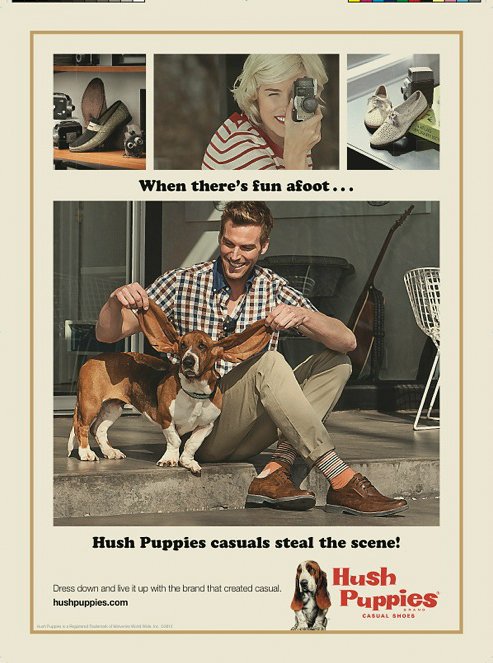
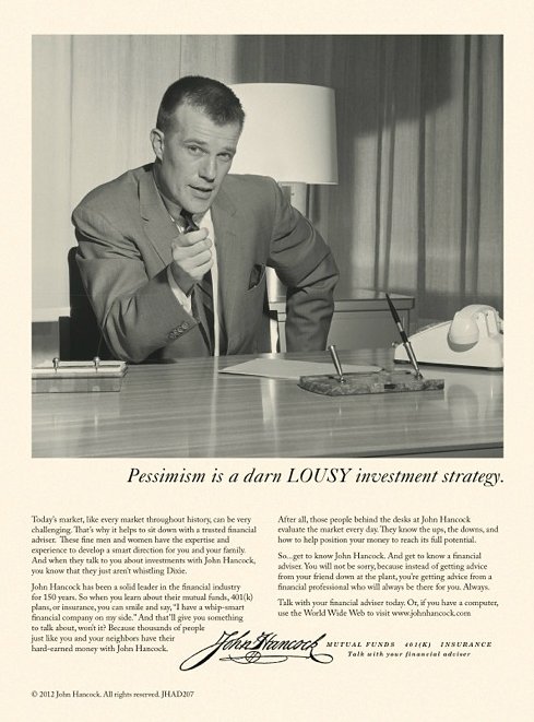
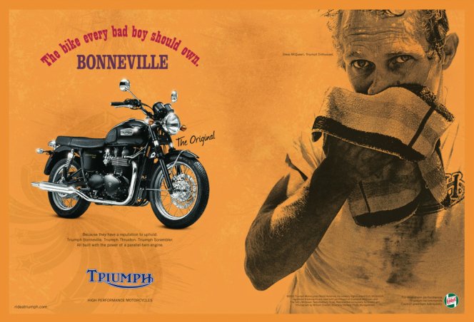
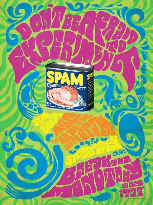
More faux-retro ads than you can shake a martini at


To celebrate the long-awaited return of Mad Men this Sunday, Newsweek yesterday launched a special issue with a retro design.

The best part, for many lucky modern admen and adwomen, was the invitation to submit special '60s-style ads for the occasion.

Some are better than others. All must have been so much fun to do.

Totally classic.

Great integration with current campaign.

Maybe a little too authentic.

I don't quite buy it. The models are all wrong.

Retro design done right.

Looks like 1990s faux vintage.

Cute.

The photo treatment could have been more authentic.

Dig the long copy.

Nicely done, with the Lyndon Johnson reference.

Too obvious for me.

Pretty authentic, but boring.

In the spirit, without being too silly.

Meh.

Captures our idea of the time.

A true classic.

The SPAM must have gone bad to make that happen.

Much better trippy design.

Cool.

Nice self-parody of their campaign.

What do you think?

All ad visuals via Fast To Create.

Friday, November 4, 2011

F'd Ad Fridays: Supersexy Swingin' Sixties Branding


The Polaroid Swinger was the first affordable instant camera, creating a whole world of opportunities for personal photography. It was also a huge enabler for amateur porn. As with the digital revolution decades later, it cut prying photo lab guys out of the picture.

How aware was Polaroid of what people were doing with its product behind closed doors?

Watch these ads and decide for yourself.


Happy Friday, everyone.

Tuesday, June 28, 2011

The YAHOO! logo meets its long-lost deadbeat father

BoingBoing has a cool post about the eerie similarity between the YAHOO! logo, launched in the digital neolithic period (1995) and the hand-drawn identity of the anti-establishment performance art movement known as the Youth International Party, or "YIPPIE!"

This is a 1960s YIP flyer secretly kept on file by the FBI of the time (recently released under the Freedom of Information Act):


Here's a side-by-side:


Whoa.

BoingBoing notes, "Yahoo's was designed by Organic, Inc. in 1995, and refined a few years later to use the Able typeface (also used in the Harry Potter franchise) Able, from foundry T26. The typeface was designed by Marcus Burlile, who was not born until the 1970s."

Now THERE's a conspiracy theory worth looking into, G-men...