Showing posts with label DDB. Show all posts

Tuesday, November 4, 2014

McDonald's Norway's weird puppet love letter to farmers


A marionette McDonald's employee meets an elderly farmer, and what follows is an oddly romantic music video:


I'm still trying to figure this one out. Here's the description by McDonald's Norge:
The film is made by Qvisten Animation and depicts the long lasting bond between the Norwegian farmers and McDonald’s. The relationship is personified by two marionette actors controlled by the amazing Ricky Syers.  
There’s of course no love story without a proper love song. The beautiful interpretation of ”When You Say Nothing At All” by Ronan Keating, says it all. Especially so considering the puppets’ rather restricted ability to express themselves verbally. They show their feelings through body language and as the film shows they’re working hard to convey Mr. Keatings words as accurately as their bodies allow.
So the message is, "McDonald's loves its farmer suppliers and they love us". But the message is played out so literally that it's uncomfortably sentimental. I mean, we're really supposed to believe that this corporation exists because it loves rural life?

This campaign fits in with the basic strategy of other farm-to-fork initiatives in the United States, Australia and Canada. But the execution, by DDB Oslo, leaves me scratching my head. It just asks for too much suspension of disbelief, leaving me more cynical than ever.

Via Facebook

H/T Burger Business
Wednesday, July 23, 2014

DDB Amsterdam thinks 1:11 of slow-motion bouncing boobs will sell tech to runners


That's right — over a minute of blurry (?), slow-mo, mammary movement because someone thought up a bad pun.


According to the TomTom YouTube Page, which claims this ad was "banned," the subject (or rather, "object") is American model Alexandria Morgan. Ads of The World lists an all-male creative team with apparently zero interest in selling any TomTom Runner Cardio watches to women athletes.


Monday, December 16, 2013

K-Y and the sexual objectification of fat middle-aged men


I'm not going to complain too much about this one, because it made me chuckle with a bit of self-effacing irony. But let's watch and see what issues this lube campaign from DDB Toronto raises:


You see, it's funny because the "warming" lube is so effective, the chubby old slob is irresistible to his more put-together wife.


While I think mature men like me can take the hit on our egos, there is another angle to consider here. In an AdWeek post on "Hunkvertising," my social media friend David Gianatasio interviewed another blogger peer, Sociological Images' Lisa Wade, about what the trendy treatment of men as sex objects in advertising actually says about women.
Many ad experts and social critics see the whole thing as a harmless turning of the tables following decades of bikini-clad babes in beer commercials. Double entendres abound when dissecting the trend, the overriding feeling being that it can’t be taken all that seriously because, after all, we are just talking about guys here. “We’re all in on the gender-reversal joke,” explains Lisa Wade, associate professor of sociology at Occidental College. “It’s funny to us to think of women being lustful.”


When the lust is treated even more ironically, as with these men who are not exactly Isaiah Mustafa, both the woman's lust and the man's sexual desirability are the gag.

As Dr. Wade added in her post about the post she was interviewed for, "the joke affirms the gender order because the humor depends on us knowing that we don’t really objectify men this way and we don’t really believe that women are the way we imagine men to be."

And here, the men aren't either. It's good for a laugh, but over the long term is it good for men and women?

Thursday, April 25, 2013

e-book campaign takes a shot at the Bible

Via Ads of The World

Copy reads:

"The Holy Bible has been printed more than 6 thousand million 96 billion) times.
Download the e-Book."

The campaign, by DDB, Bogota, goes after The Little Prince and Don Quixote as well, but neither is as as potentially (and amusingly) poignant as this one. It was possibly the first book printed in the west (using movable type) and is celebrated for being the best-selling nonfiction book of all time.

Interestingly (from a mythological point of view) if Adam and Eve really had denuded the forests that quickly, they would have been spared both the forbidden fruit and the fig leaves.

Hmmm...


Monday, January 28, 2013

McDonald's Australia offers supply-chain transparency app

The changing consumer perception of food is starting to have a real influence on fast food chains. In 2011, McDonald's USA started a "farm to fork" campaign about their ingredient sourcing. Last year, McDonald's Canada launched an "ask us anything" site to try to dispel urban legends about their food. Now, according to Burger Business, McDonald's Australia (Known there as "Macca") has gone even further with the marketing transparency, creating an app that can source the farms and producers who created the ingredients for your actual meal. This video explains:
Burger Business writes:
In its Facebook film explaining the app, McDonald’s admits that there remains “some confusion about just how real our food is,” despite its having spent many years and tried a variety of approaches to explaining its food sourcing and preparation. No amount of food-quality information will suffice for some fast-food haters, vegetarian activists and food elitists, but McDonald’s has provided far more transparency on this issue for a longer time than has any other QSR chain.
I'll give McDonald's points for effort, if not for the actual products. Supporting local farmers and producers is great. Pushing highly-processed packages of sugar, salt and fat on families... somewhat less so. But it's great to see big brands reacting to grassroots change.

Wednesday, September 19, 2012

Amnesty ad compares arms trade to tsunami disasters

(Cross-posted at Osocio)


Oh, dear. Remember this fiasco?


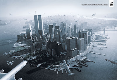
Created by DDB Brazil for WWF Brazil, it ignited a firestorm of protest, which WWF's international office first disavowed, then admitted may have been the approved regionally. On this year's September 11th anniversary, Buzzfeed's Copyranter named it #1 in his list of "The Five Worst 9/11 Exploitation Ads".

You could say that it simply tells an inconvenient truth about inconsistent cultural attitudes towards tragedy and death. But that point would be made at the expense of causing further hurt to the families of the World Trade Centre attack, as well as to those deeply affected by it.

Now, strangely, the 2005 tsunami tragedy that is being exploited to make a point about war and the arms trade:


The ad is by TBWA, Paris, for Amnesty International.


This brings the saga of over-produced, tragedy-exploiting ads full circle: "an epic and tragic natural disaster killed more people than an infamous terrorist act, but the arms trade is even worse."

(Admittedly, it could also be a reference to the more recent Tōhoku earthquake and tsunami.)

Once again, creatives go for maximum impact to make one message of human loss at the cost of trivializing another. This kind of trade-off is a devil's bargain, in my opinion. It's all bad. You don't need to get into a comparison of which is worse. From my perspective this looks like lazy strategy and the elaborate (yet derivative) execution is blatant award-bait.

And I say this as a member of Amnesty. You can do better than this. You often do.


Tip via Ads of the World

Tuesday, July 31, 2012

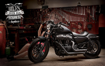
"Bikes over bitches, bro!"


This campaign, by DDB Bogota, is anything but subtle. 

Like the infamous t-shirt, "If you can read this, the bitch fell off," it's a sad reminder that woman-dehumanizing macho culture is still accepted by male-dominated consumer tribes.


Executive Creative Director: Rodrigo Dávila
Creative Director: Marco Muñoz
Art Directors: Oscar David Martínez, Oscar Mejía, Adrián Arroyave, Mauricio Cortés
Copywriters: Juan David Arboleda, Andrés Estrada
Photographer: Tato Gómez


Via IBIA

Wednesday, May 30, 2012

Oh, nursing professionals will **love** this one

All ads via Ads of The World

I've worked with our national nurses' association, as well as done tons of healthcare branding, advertising and recruitment. If there's one thing I've learned, it's that nurses absolutely hate this shit. 


Not only is the "sexy nurse" stereotype (who is always female) damaging to the dignity of all women, it is particularly insulting to a professional cadre who are universally loved for caring for us at some of our lowest ebbs. As one nurse once told me, "the first person and the last person who will touch you when you are alive, will probably be a nurse.


Don't you think she (or he) deserves better than this?

The campaign is for a disposable syringe company, claiming that re-use of syringes (gross) is the #2 spreader of HIV. I usually think of this in back-alley smack terms, but I suppose its possible that Indian hospitals sterilize and reuse glass ones. But is this a stretch in correlation? 

Ask DDB.


Wednesday, May 9, 2012

Subway talks trash about fast food


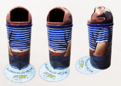
If real, this is pretty weird. According to a post on Ads Of The World, it's a Subway campaign for DDB Puerto Rico.


Weirdness aside, there are two things about this campaign that bug me:

First, what fast food brand in its right mind would want their logo associated with disgusting, smelly, garbage trucks and bins? Even with the "feed them better" tagline, it's bound to cause some visceral negativity around the brand.

Second, Subway is hardly health food. According to their site, even a 6" version of their tuna, Italian, and pizza subs have almost 500 calories. (Specialty six-inchers like Big Philly Cheesesteak, Buffalo Chicken, and Chicken & Bacon Ranch Melt have 500 or more.)

At McDonald's, a Big Mac is more calorie-iffic, sure, at 550, but the Quarter Pounder w/Cheese is 520, and a regular hamburger (does anyone eat those?) is just 250 cal.

Sure, you can go all Jared and get a low-fat turkey sub with no cheese and mayo. But McDonald's also sells salads. The point is that you can get an Angus Bacon & Cheese (790) with fries and a Coke (note that all numbers on the McSite are "small only") or you can get a footlong Big Philly Cheesesteak (1000) with chips and a Coke. Both meals are arterially terrifying crap.

So where does Subway get off being all less-junkier-than-thou?

Tuesday, May 8, 2012

McDonald's wants you to buy your kids' love with McNuggets

It's always been known that McDonald's real brand promise is "buy your children's love". They create this opportunity by marketing so effectively to kids that they think anything tastes better in a McWrapper. Then they sappily remind third- and fourth-generation McParents how great they felt when they went to the Golden Arches.


Knowing all of this, and as cynical as I am, I was still shocked when I saw this print campaign on Copyranter's Buzzfeed blog.

DDB New York has produced what may be the most blatant execution of McDonald's brand strategy by telling parents that even if they suck at making their kids happy, the anodyne is a quick trip to the Mc, where a few bucks worth of sugar, salt, fat and designer flavours will make it all okay.


Yeah, it's supposed to be clever and funny. No, I am not laughing. Especially in regards to the one where a little boy is abandoned in a dark soccer field because mom or dad simply forgot to pick him up:


Show some responsibility already, McDonalds and DDB. Or at least be a little more subtle in your evil manipulation of parental love. OK?

Wednesday, May 2, 2012

The mindless tyranny of the "Rule of Three"


We are all obsessed with threes. Blame School House Rock. (That, and centuries of myth and numerology.)

Ever since I began my career in advertising, the number 3 has been a pain in my creative ass — particularly when it comes to print campaigns. We sit down to brainstorm a campaign, and unless it's a one-off, we always feel compelled to try and make three equally awesome versions of the same "big idea".

The first one is usually great. The second can be also. But the third — that extra push to make it a nice, round numbered campaign — is too often a compromise.

I believe this obsession with three execution print campaigns is universal. I see it all the time in places like Ads of The World, where agencies try to clone one or two good ideas into a "full campaign".

Here is a perfect example:


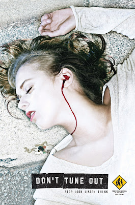
Some very creative people at  DDB, Sydney, Australia, came up with a clever (if gory) visual idea to communicate the dangers of crossing the road with earbuds on. It's a little shocking for my taste, but it is original (as far as I know) and the execution is solid.

But is it "campaignable?" is always the Creative Director's question. They most likely then looked into other deathly representations of various types of headphones and other peripherals for music players and smartphones.

But what did they come back with?


The same... bloody... ad. But with a man.

What a waste of photography and art direction to duplicate the first idea. (I don't actually know in which order these were conceived, but stay with me here.)

I understand that sometimes clients feel that viewers cannot identify with a person in an ad who is not like them — sexually, ethnically, age-wise or whatever — but I would have argued that the concept was strong enough to overcome that. And the duplication just dilutes the "wow" factor of the original.

But they kept going:


There. Now we've increased the age and ethnic diversity of the campaign. But at this point, I don't even process the concept anymore. I just think that the creative team stubbornly stuck to the one good idea they could come up with.

Damn Rule of Three. It totally ruined an otherwise impressive campaign.

Friday, November 25, 2011

F'd Ad Fridays: It'll vacuum your WHAT?!?

Via Healthy Ads

Just what the hell is this laxative ad from DDB Health & Lifestyle Mumbai trying to say? It will vacuum out your colon? That must be some nasty poop pill.

Friday, September 30, 2011

F'd Ad Fridays: Art Direction gone overboard in Finnish McDonald's ad


It's a bacon cheeseburger. A bacon Goddamn cheeseburger. If you are talking to someone who is hungry for a bacon cheeseburger, then it is enough to show them a beauty shot of one, perhaps with a low pricepoint. And then they will buy it. Maybe even two, if they're drunk.

But this, DDB Helsinki, this ad is not designed to sell cheeseburgers. It is designed to make other Art Directors say, "hey! cool!'. And they are quite possibly vegans.

Via Ads of The World

Thursday, July 7, 2011

Marmite invites you to hate haute cuisine

Marmite, which I have always assumed tastes like whatever ear wax tastes like, takes some cheap shots at haute cuisine in these spots from DDB UK:


Using a frog and a snail is also a clever way to appeal to the British working man by taking a piss on the rival French — long known for eating such critters.

Via AdFreak

Wednesday, May 4, 2011

Kids GIS the darndest things

This could have been a really great campaign about unfortunate Google Image Searches that kids make. But instead of taking it to the next level, the creative team gutterballed it:

“Let kids stay kids. Use parental control.”

"Wet Pussy"? Was that really the best you could come up with? How likely would it be that a kid young enough not to know the slang would choose those exact two words, as opposed to the more common "cat", or "kitty"...


And this one's just annoying, not only because of the improbability of "black cock" as an innocent search, but also because it feeds off of that racist sexual fetishism some people have for black men.

As a parent, I know how this kind of thing really goes down. It's the truly innocent search for "beaver", "facial", or even "toe" that ends up in the bad place. And those examples (only the tip of the iceberg) are far more shocking and more likely to be stumbled upon.

These ads are actually by DDB, Buenos Aires, so I wonder if there's a language issue at hand here. Perhaps they just used the limited English slang that they (and their audience) know.

Via I Believe in Advertising

Thursday, February 24, 2011

Women's bodies exploited by advertiser

Literally:


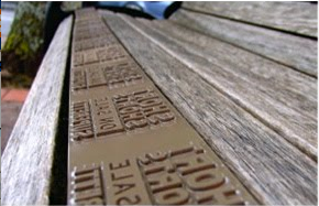
Posted on Copyranter this morning, this purports to be a guerilla move by DDB Auckland to get more impressions (ha ha tee hee) for NZ fashion boutique Superette:

"We put indented plates on bus stop, mall, and park benches, so that when people sat down, the message was imprinted on their thighs. This meant that as well as having branded seats, a veritable army of free media was created, with thousands of imprints being created and lasting up to an hour."


As Copyranter noted, probably none of the un-staged impressions was particularly legible. But of course that's not the point anymore. Guerilla and ambient work these days is designed to appeal to a global internet audience (and awards show judges) rather than to function in the meatworld.

But points for finding a new way to impose sexy advertising on women.

Tuesday, September 28, 2010

I'm lovin' it

I'm not a big fan of McDonald's as food (except for the Egg McMuffin, the best breakfast ever) or as a marketing machine aimed at kids. But this new Australian ad from DDB Sydney, aimed at men, does a pretty good job of playing into the ironic manliness that is coming back into vogue:


(Link via Make The Logo Bigger)

Canadian readers are already familiar with this campaign, though. It was Harvey's "Meat.Fire.Good." and "Long Live the Grill" campaigns from the mid 2000s.

Nonetheless, I'm always up for a good laugh at myself.

Wednesday, September 1, 2010

Transit advertising, Italian style

Saw this campaign on I Believe in Advertising.

The illustration is cool. The art direction is divine. But... puzzle pieces as a concept? Non e' troppo originale, ragazzi!

The following is for Milan's public transit system, ATM:


Nonetheless, this campaign from DDB Milan is a pretty simple expression of what public transit's value is to people in a big city: connecting you. Plus, it works with their colour-coded metro system, which I got to know when I lived there. 

As someone who has been in transit advertising for almost 10 years, I have to say that just reinforcing the connection between transit and life is what it's all about.


Friday, August 27, 2010

Fantastic Plastic Mockumentary


Fellow Osocio blogger Armando posted this epic "mockumentary" by DDB LA, about the secret life of discarded plastic bags:


It's long, but worth watching all the way through. That's because it has the three things that make a smart parody great:

1) Love of the subject matter — Just as Spinal Tap reveals the writers' and actors' obsession with rock music, this video betrays the Creatives behind it as nature documentary geeks like me. For every four minutes of hilarity, imagine a lifetime of Wild Kingdom, Lorne Greene's New Wilderness, and especially BBC's David Attenborough.

2) Attention to detail — This follows naturally from #1. To make it work, you're got to remain true to form throughout. The voiceover's British accent and over-dramatic delivery, the lovingly-filmed beauty shots, and especially the night vision are absolutely bang-on.

3) Playing it straight — This seems like the hardest thing for many advertisers and comedians to do. There's always the temptation to either let the audience know you're in on the joke, or to laugh at your own wit. But as soon as you break that fourth wall, all is lost. This video keeps a straight face to the bitter end.